4 book covers for the play, "Happy Days".
My concept for the book covers is blind-optimisim. Winnie is blindly optimistic in her situation despite her unfortunate dilemma. She uses happiness, optimism, discovery of new things, etc. as a means of self-defense from herself caving into the torment she truly is in.
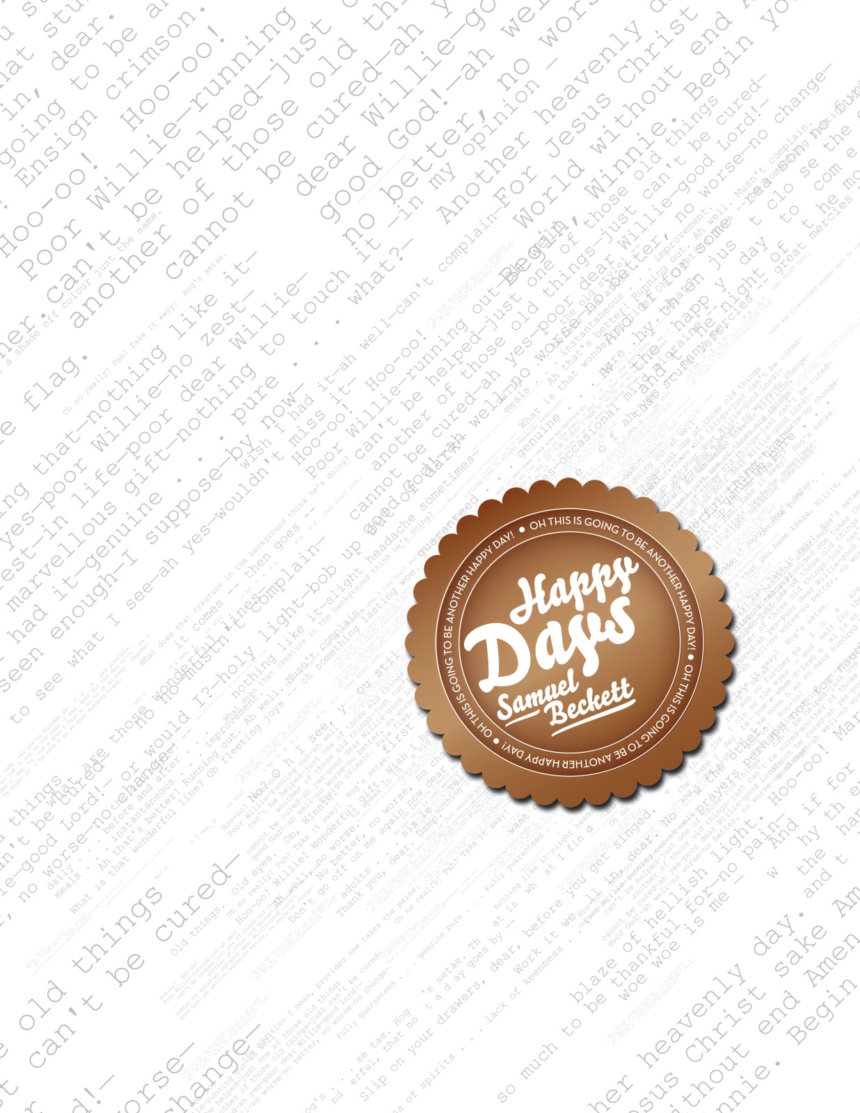
This cover typographically shows the audience's perception of Winnie's speaking as coherent at first, but progressively becomes incoherent and and all over the place. The stamp is a stamp that Just negates the chaos behind as it "stamps" happiness onto her misery bringing in the blind-optimism concept.

This cover also demonstrates blind-optism using a bar to graphically blind the happiness of the woman. The woman's face is used as the stamp here as it appears cut-out and out of place further expressing the blind or forced-optisim concept here as well.

This covers uses the type that Winnie speaks throughout out the play as a graphic device that is eating up or devouring her inside, although she still maintains a smile in order to protect herself from her misery.

This final cover communicates the concept of blind-optisim/happiness in the most clear way, as it as all that is seen. This ribbon like graphic also further demonstrates how she almost labeling her blind-optisim as she is aware of what she is doing.
1 comment:
Ben,
I still like the last one, but I would try to replace black bend with white. (Black feels like a pirate : )
All of your covers are strong in their own way. My least favorite is #1—it is pale somehow and the title looks like a chocolate. Why?
The idea of the transition form the coherent to incoherent speech is very interesting to me, but it is not expressed yet.
Olga
Post a Comment