hi Olga,
Just wondering do you have the "modena" font designed by him? thank you very much
Rochelle Jiang
Thursday, November 10, 2011
Wednesday, November 2, 2011
Neville Brody
Hey Olga this is Jordan, do you have any of Neville Brody's typefaces? Also are we back to visual music for tomorrow?
FF family
Arcadia
Insignia
Arena/Stadia
Avanti/Campanile
Industria
FF family
Arcadia
Insignia
Arena/Stadia
Avanti/Campanile
Industria
Monday, October 31, 2011
Jonathan Barnbrook
Hey Everyone,
Im having a hard time finding any fonts by Barnbrook if anyone could look it would be greatly appreciated (I might even bring you a donut..). Im looking for any of the following fonts;
Exocet
Priori
Tourette
Bastard
Mason
Infidel
Bourgeois
Delux
Expletive
Shock & Awe
Newspeak
Echelon
Patriot
Also, check out this video, its wonderful!
http://vimeo.com/29399425
Corey
Saturday, October 29, 2011
Marian Bantjes
Hi Olga:
This is Deirdre Waski. I have Marian Bantjes for the Banner project.
I know she has the typeface Restraint do you know anyway to get a hold of it?
Also because she hand draws or uses other mediums is there a typeface you
could recommend me?
I appreciate this. Thank you
This is Deirdre Waski. I have Marian Bantjes for the Banner project.
I know she has the typeface Restraint do you know anyway to get a hold of it?
Also because she hand draws or uses other mediums is there a typeface you
could recommend me?
I appreciate this. Thank you
Sunday, April 17, 2011
Happy Days- Katie Erickson
This is Katie, I've changed the inside so it doesn't rely so strongly lines. The concept is about being Winnie being stuck in endless days.


Friday, April 15, 2011


Tuesday, April 12, 2011
Happy Days

Hi, Olga-
Thank you for the comment last week - it was very helpful :)
I tried combine 2 of my cover which you recommended -
and cleaned up the flaps (I had broken and overlapped paragraphs last week..)
and changed typeface of the title,"Happy Days".
(Mercury --> Akzidenz Grotesk which used in my other mirror posters)
Do you think it's still too dark for the play?
Thank you for your time - - - :)
Kay Dongmin Kim
Happy Days covers - Kelly Park


Hello,
I tried few more explorations for the cover.
Last week, you thought DIN (what I used for Samuel Beckett) suites better for the title (happy days). I like DIN's alphabet, but I do not like its punctuation. it's too rigid…
Comma and periods are my element and DIN's comma and periods look like blocks.
So should I used different typeface for punctuation or just use different typeface for title overall?
I am not sure which combination of typefaces work the best... so far...
Please help!! thank you. :)
-kelly
Monday, April 11, 2011

endgame
Ok so i(Brian) did a new concept and it is broken. My media is a broken bottle i had from breaking it into pieces and scattered around. I figured stepping out of the box is a good idea. The glass pieces are broken and scattered around explaining how much of a mess clov and hamm are.


Thursday, April 7, 2011
ENDGAME
Hi, this is Soomin.
I revised my cover and made samples for interior of the book. I desperately need your opinions :'D
Thank you and Good Luck guys!!!


I revised my cover and made samples for interior of the book. I desperately need your opinions :'D
Thank you and Good Luck guys!!!


This is endpaper. I'm doing french binding.

first page©right page(this is french binding, this is gonna be right and left page)


second page

the list of characters
I tried to express 4 characters' movement(?) with names. Each name has different weight and movement.
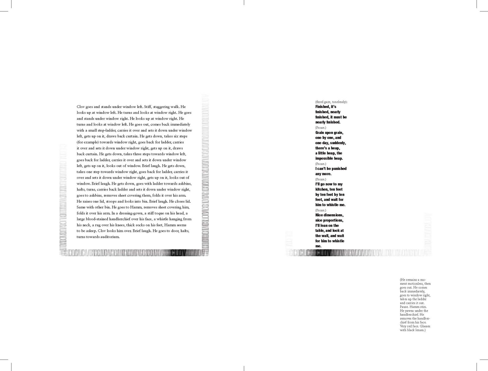
Clov gets up and down with a ladder.

Wednesday, April 6, 2011
Kelly Park Happy Days covers.


Hello,
I am working on my Happy Days covers. My concept is never ending monologue.
I am using coma and ellipsis as my visual element.
I am not sure if I need to make cover more busy, complex because she is talking a lot and sometimes it's confusing what she is really talking about. or leave it simple and clean and display the idea of repetition and talkativeness with coma and ellipsis only.
-Kelly Park
Tuesday, April 5, 2011


Hi,
I have 3 covers for Happy days-
My concept is the mirror that reflects Winnie.
I thought Winnie is talking to herself in the play, like sometimes people looking into the mirror and talk to themselves.
The play is surrealistic, so I used surreal settings with mirrors facing each other which have endless reflections.
the second one - Winnie's talking herself looking into the mirror but she can't get any answer even from the mirror because she's looking her back.. Is she really looking into it from the outside? or she is also one of the endless reflections?
1,3,4th - the same concept using only type that trapped inside of the endless reflections.
Thank you :)
Kay Dongmin Kim

Monday, April 4, 2011
Happy days poster and dust jacket(JuYoung Lee)


This is my poster and dust jacket design for happy days by Samuel Beckett.
I used recycling symbol for my theme "repetition."
The symbol does not only represent the repetition, but also Winnie's life as well.
That is why there is an umbrella, which Winnie is always holding.
I tried to symbolize and simplify Winnie's life, and connect to my theme.
Thank you =)
Subscribe to:
Comments (Atom)