Thursday, October 29, 2009


hello again,
i want to thank you guys for all your help! i couldn't figure out how to add new images to that post so i had to start a new one. here are two more versions following all your advice. please let me know one more time what you think :) personally, of these two, i like where the bottom one is going.
thanks again! you guys are great!
-elisa

Wednesday, October 28, 2009


hey its elisa.
we talked in class today about this design, which is the climax of my music plus its going to be a cover. olga suggested that i try take out the outline and stick with one typeface. the last image is my original, and the top 3 are revisions. please check them out and let me know what you think. thanks!


Monday, October 26, 2009

Hello, this is Rebecca from Wednesday's class. My idea for Eleanor Rigby:


it is a rough sketch but I just want to see if the idea would work before I continue. The first image is my typography and the second image is what I want to go over the type. It will be hand drawn with a blue pen. Not every section of type will have a drawn person/leaf. But depending on what part of the song, the image will be big or small. Please HELP!!

Saturday, October 24, 2009

Yesul's Idea


Hello Olga,
This is my brief ideas for Visual Music. Both book and cover

Hope you can understand my ideas from here.
YOu have to click it to zoom it.

Thank you


yesul87@hotmail.com
303-868-8469

Friday, October 23, 2009

Hi this is Michelle from the Thursday class


these are some spreads my visual music project
Just wanted some feedback
thanks

Yulia Brodskaya

Cut paper typography by Yulia Brodskaya


We spoke about this in thursdays class, thought it might help provide some inspiration.

Adam

Thursday, October 15, 2009

visual music

hey, elisa here.
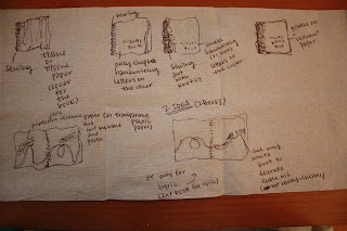
anyone know a good way to post our visual music books? i dont know what way would be best to view something so horizontal without having to upload a jpeg of each individual page. any ideas?
thanks

Saturday, October 3, 2009

Welcome 2009 typographers!

I hope you are working on your typographical part of the assignment.
My recommendation to all of the students is to choose a very neutral generic typeface and design the rhythmical structure of the words as they are sung, synchronistically with the right measures of the musical time. That is a very difficult task and the core of this very experimental assignment. That is really a transcribing of oral tradition. As soon as you layout the whole text, find an interesting and inventive way to capture the rhythm with typography, only then you can start thinking about different typefaces to use. Generic typefaces will give you more freedom of rhythm for now.
Please, don't mix two compositions (lyrics and visual music). We are going to look only on your typographical solutions.

The typographical layout is due this week.

Olga